Subtle Colour Codes
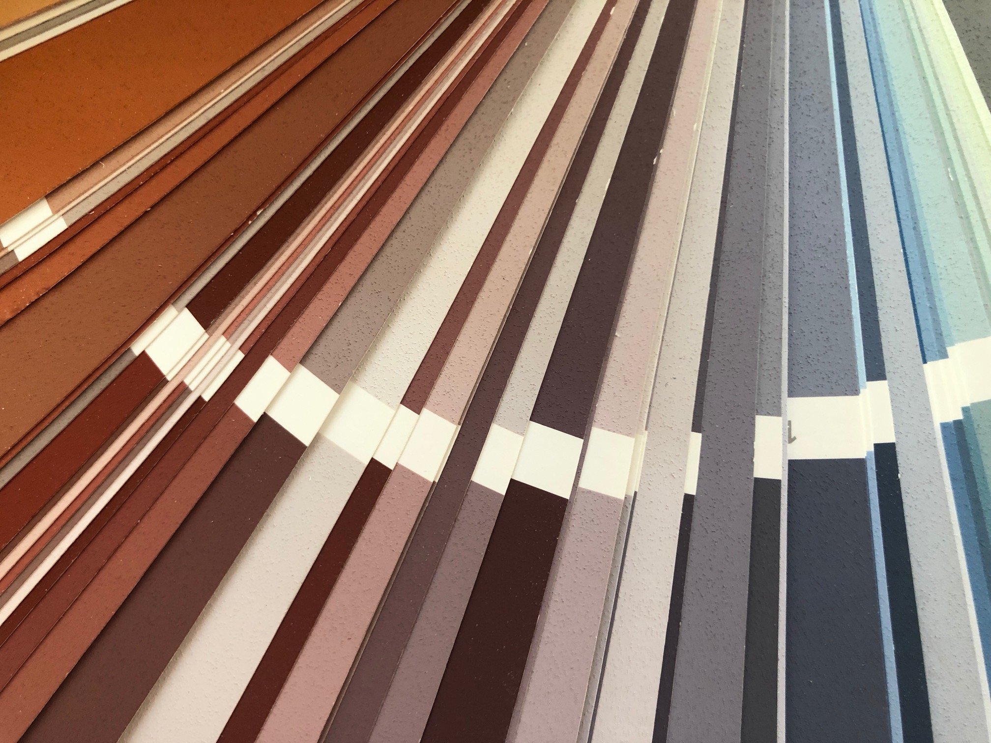
The fine tones of destilat
Colour is zeitgeist - every era has its palette with which it knows how to express taste and attitude to life. In architecture, it is an elementary means of design - no less powerful than the cut of a room. Yet colour in itself has no materiality - it is a sensory impression created by light and reflected by surfaces in countless facets, depending on the material's properties.
Science has always been passionate about the creation, perception and correct ordering of colours - Isaac Newton, Johann Wolfgang von Goethe or Johannes Itten drew their personal picture of colour, defined theories and illustrated models with their colour tones. Our Stone Age ancestors were also concerned with the visual quality of colour when they used clays and colouring plants to depict nature and their everyday lives in cave paintings.
Colour has a tonality that stimulates our psyche, is charged with symbolic power and evokes different emotions depending on the culture - values that designers from all sectors have always known how to use. Colour also plays an important role in our designs. It is the quiet tones that characterise our interiors - light nuances and subtle shades. We often show materials purely and in their original colouring; we play with natural and earthy colours that are elegantly restrained and lend the room lightness, depth and a special atmosphere.